LOGOS REVEALED: Hidden Corporate Symbols You Never Knew About
Most people do not know this but some of the world’s biggest corporations and well known brands have hidden symbols embedded within their logos. Sometimes these companies pay out millions to marketing firms to purposely plant these psychological seeds and sometimes, as is the case for the Coca-Cola logo, it is just sheer coincidence.
1) BASKIN ROBBINS
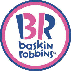
Baskin Robbins seems like it has been forever, growing up as a kid I would be in heaven when the sweet taste of their Rocky Road touched my lips. But I bet many people do not notice that the pink parts of the letters “B” and “R” in their logo form the number 31, which is part of their infamous “31 Flavours” slogan.
2) AMAZON.COM

Amazon.com is a global powerhouse when it comes to online shopping with over 89 warehouses around the world and their 200+ million user base we can definitely see why their logo includes a smile that delivers everything from “A” to “Z”
3) FEDEX
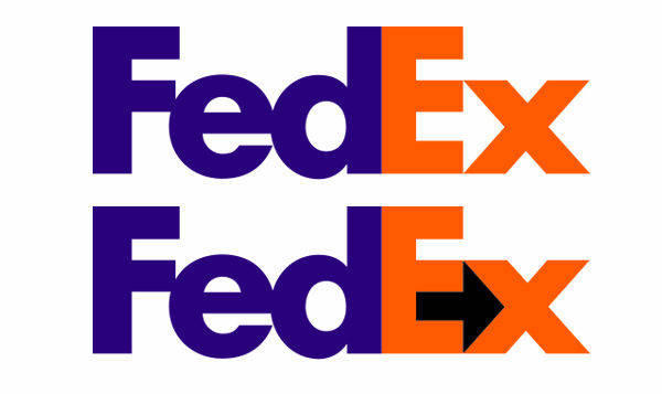
From the Fedex logo we can see that the negative space between the “E” and the “X” forms an arrow a reminder that the company is constantly moving forward.
4) SPARTAN
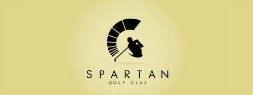
This is one of the coolest logos I’ve seen and shows that with the right creative team in your marketing firm you can really blend what your company is about with your logo. In the above picture we can see that the golfer’s swing along with his golf club makes up the Spartan’s bust. Really creative.
5) TOUR DE FRANCE
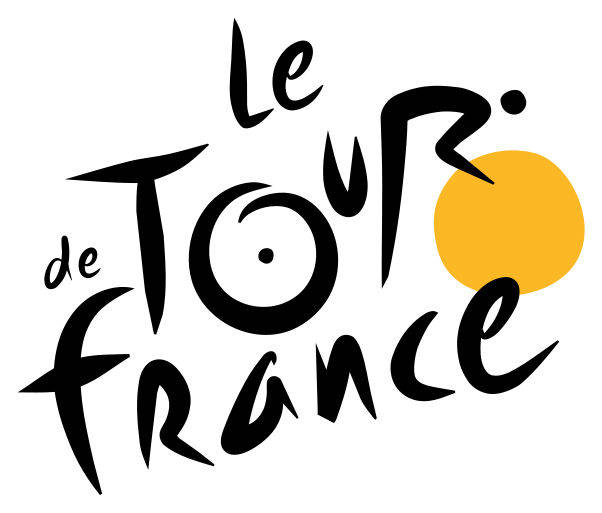
We can see from the Tour de France logo that “O”, “U”, “R” from the word “TOUR” form a silhouette of a person riding a bike, the golden sun completes the image as the bike’s front wheel.
6) CISCO
The San Francisco based tech company pays homage to it’s roots by having the Golden Gate Bridge incorporated in it’s logo.
7) ADIDAS
Adidas has managed to marry a mountain on top of its logo. A true symbol of the heart, dedication and work athlete’s must climb and overcome to better themselves each and every day.
8) FORMULA 1
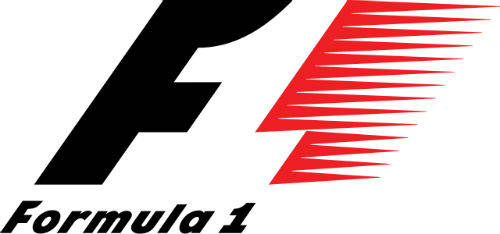
The negative space between the speeding “F” and the red drag it’s creating is actually the number one in Formula 1’s iconic logo.
9) SUN MICROSYSYEMS
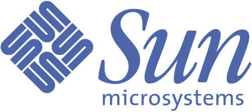
To the untrained eye the symbol next to “Sun Microsystems” might resemble a tangled mess of wires but at closer inspection with can see it is the word “SUN” formed with the letter “U” in various directions.
10) MCDONALD’S
Yes the main reason McDonald’s logos is a golden “M” is indeed for the fact that the company’s name starts with the same letter, but few people know that during the ’60s McDonald’s actually wanted to change their logo, but their design consultant and psychologist Louis Cheskin insisted that they left the golden arches. He stated that curvaceous arches actually resemble a “pair of nourishing breasts”, pretty convenient thinking that went well with their earlier advertising slogan of ““Give Mom a night off”
11) COCA-COLA
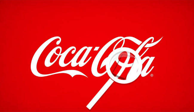
What seems like a complete coincidence, we can see that part of the Coca-Cola logo forms what seems to be the Danish flag. When Coca-Cola caught on to this they decided to take advantage and setup an interactive airport display that dispenses Danish flags to arriving visitors. Pretty smart of them.
12) WENDY’S
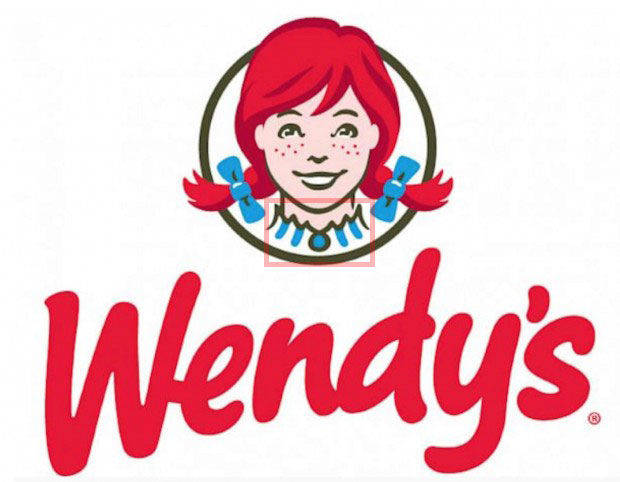
We can see that Wendy’s collar actually forms the word “MOM” again this might be a similar psychological game McDonald’s was trying to play in the 60’s by somehow relating the restaurant and food you eat in it, to being the same that your mom would feed you.

